A Sankey chart, also known as a Sankey diagram or flow diagram, is a type of data visualization that represents the flow of resources, energy, or other quantities between multiple entities or categories. It is often used to visualize the distribution or transformation of resources, such as energy, money, or materials, through a system or process. The chart is named after Captain Matthew Henry Phineas Riall Sankey, an Irish engineer who created this visualization method in the late 19th century.
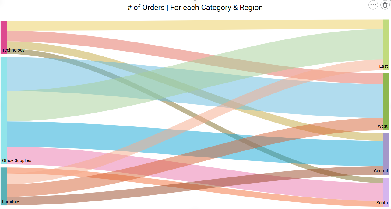
Sankey charts consist of interconnected arrows or lines, with the width of each arrow proportional to the quantity it represents. The key elements of a Sankey chart typically include:
- Source and Destination Nodes: These are represented as rectangles or boxes and represent the categories or entities where resources originate and where they are ultimately consumed or transformed.
- Flow Arrows: These arrows connect the source and destination nodes and represent the flow of resources from one category to another. The width of the arrows is proportional to the quantity being transferred.
- Labels and Values: Each arrow is often labeled with a description of the flow and, in some cases, numerical values to indicate the quantity of resources being transferred.
Sankey charts are particularly useful for visualizing complex systems or processes where it’s important to understand how resources are allocated or transformed. Common applications of Sankey charts include:
- Energy Flow: Visualizing the distribution of energy sources and their consumption in a building or a country.
- Material Flow: Tracking the use of materials in manufacturing or understanding the waste flow in a recycling process.
- Budget Allocation: Illustrating how a budget is distributed among different categories or expenses.
- Sales Funnel Analysis: Showing how potential customers move through different stages of a sales process.
Creating a Sankey chart typically requires specialized software or tools that can handle the complexity of drawing and managing the flow lines and values. Some popular data visualization tools like RubiSight,Microsoft Excel, Tableau, or open-source libraries in programming languages like D3.js can be used to create Sankey charts.
Sankey charts offer a visually intuitive way to analyze and communicate complex data, making them a valuable tool in various fields, including energy management, environmental science, finance, and more.