RubiSight widgets, also known as charts, are the building blocks of visual data storytelling dashboards within the Rubiscape platform. They are essentially visual representations of your data that help you explore, understand, and communicate insights effectively.
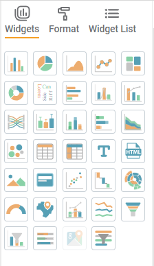
There are many different types of RubiSight widgets available, each with its own unique purpose and strengths. Let’s Go through each type of widgets and their usage one by one :
Dimensions : These represent the categories you want to compare. Examples include regions, product categories, customer segments, time periods, etc. You can have one or more dimensions, but too many can clutter the chart and make it hard to read.
Measures : These represent the values you want to compare for each category. Examples include sales figures, website visits, customer satisfaction scores, etc. Again, you can have one or more measures, but try to limit it to a few for clarity.
1. Basic Charts :
1.1 Column Chart :
One or more Dimensions
One or more Measures
Ideal for comparing categories across a single measure. Use it to track sales figures by region, website traffic by source, etc.
-
When to use:
Simple comparisons, Ranking categories i.e. to Identify the top or bottom performers among a set of categories, to track Trends over time -
Best Practices:
Use clear and concise labels for your dimensions and measures.
Sort your categories for easier comparison.
Choose colors that are visually appealing and easy to differentiate.
1.2 Pie Chart :
One or more Dimensions
One measure
Shows the composition of a whole. Use it to represent market share distribution, customer demographics, etc. (Remember, limit pie charts to 4-6 slices for readability.)
When to use:
Showing simple composition: Great for visualizing a single measure divided into clear, distinct categories (e.g., customer demographics, website traffic sources).
Best Practices:
Limit to 4-6 slices: Too many slices lead to clutter and difficulty interpreting the data.
Highlight key slices: Use color or positioning to draw attention to specific categories.
Limitations:
Difficult for many slices: Comparisons become unreliable with too many options.
Area illusion: Larger slices can trick our brains into thinking they’re more important than they really are.
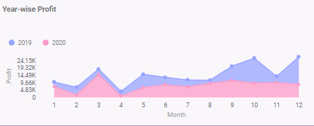
1.3 Area Chart :
One or more Dimensions
One or more Measures
Similar to a line chart, but emphasizes the magnitude of change. Use it to visualize sales volume over time, stock price fluctuations, etc.
When to use:
Visualize trends with magnitude: Show how a measure evolves over time and its overall level (e.g., sales volume, website traffic, stock prices).
Compare multiple trends: Stacked areas let you see how different categories contribute to the overall change.
Best practices:
Limit series (3-5): Too many lines make it hard to understand.
Start y-axis at zero: Shows accurate magnitude and changes.
Limitations:
Large datasets: Overlapping areas can be confusing.
Individual fluctuations: Might not capture subtle variations within lines.
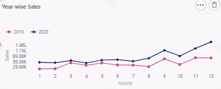
1.4 Line Chart
One or more Dimensions
One or more Measures
Tracks trends and patterns over time. Use it to monitor website traffic trends, analyze stock price movements, etc.
When to use:
Tracking trends: See how things change over time, like website traffic, stock prices, or sales.
Highlighting continuity: Show data points as connected, emphasizing gradual changes.
Best practices:
Limit lines (5-7): Too many lines make it hard to see what’s happening.
Start y-axis at zero (usually): Shows changes from the baseline more clearly.
limitations:
Too much data: Lines can overlap and become confusing.
Unevenly spaced data: Can misrepresent trends if data points aren’t equally spaced in time.
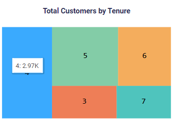
1.5 Treemap Chart
One or more Dimensions
One Measure
Displays hierarchical data in a space-filling tree structure. Use it to visualize organizational structures, product categories, etc.
When to use:
Visualizing hierarchical data: Think family trees, organization charts, or product categories with subcategories.
Comparing sizes within a hierarchy: Rectangles sized by data values, letting you easily compare units at different levels.
Best practices:
Sort strategically for clear understanding and comparisons.
Add tooltips for detailed information on hover.
Consider interactive features for drilling down the hierarchy.
Limitations:
Too many categories at once: Rectangles becoming tiny and unreadable.
Misleading size perception: Larger areas seeming more significant than they actually are.
2. Spacialized Charts :
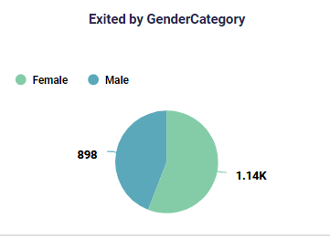
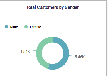
2.1 Donut Chart
One or more Dimensions
One Measure
A variation of the pie chart that highlights a specific subset. Use it to show website conversion rates by source, customer churn by reason, etc.
When to use:
You want to highlight a specific segment within a whole (e.g., website conversion by source, customer churn by reason).
Best practices:
Limit to 4-6 segments for clear comparisons.
Consider other charts if you have many categories.
Limitations:
Difficult to compare many slices accurately.
Area illusion can distort perception of sizes.
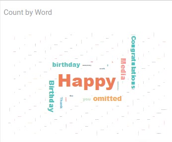
2.2 WordCloud Chart :
One Dimension
One Measure
Represents text data with font sizes reflecting word frequency. Use it to analyze social media sentiment, customer reviews, etc.
When to use:
Analyzing large amounts of text data (e.g., reviews, social media).
Identifying key themes and topics.
Visualizing sentiment (positive/negative).
Best practices:
Preprocess text (remove stop words, etc.).
Limit words (around 100-200).
Limitations:
Not recommended for Highly structured data (numbers, categories).
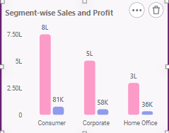
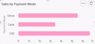
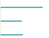
2.3 Bar Chart :
One or more Dimensions
One or more Measures
Similar to a column chart, but with horizontal bars. Use it to compare categories with long labels or when space is limited.
When to use:
Comparing categories with long labels, where space is limited.
Highlighting specific categories by positioning them top or bottom.
Best practices:
Limit the number of categories (consider grouping if needed).
Sort bars strategically for context and clear comparisons.
Limitations:
Many categories (can require scrolling or zooming)
2.4 Histogram :
One Measure
When to use:
Analyzing the distribution of a single numerical measure (e.g., customer age, income).
Identifying data skewness, value range, and potential outliers.
Best Practices:
Choose appropriate bin size for balance between detail and clarity.
Consider overlaying a normal distribution curve (optional).
Highlight outliers (optional) for further investigation.
Limitations
Categorical data (e.g., product types).
Drawing definitive conclusions due to binning limitations.
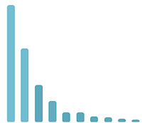
2.5 Pareto Chart :
One Dimension
One Measure
When to use:
Identify the “vital few” categories contributing to most of a measure (e.g., 80/20 rule).
Analyze customer satisfaction, sales by product, website traffic sources, etc.
Best practices:
Limit to 8-10 categories to avoid clutter.
Sort bars in descending order of magnitude.
Use contrasting colors to highlight the Pareto line (80% cumulative contribution).
Consider adding data labels or tooltips for specific values.
Limitations:
Not ideal for visualizing complex relationships or trends.
Assumes a power-law distribution (80/20) may not apply to all data.
3. Advanced Charts:
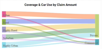
3.1 Sankey Chart :
Two Dimensions
One Measure
When to Use:
Visualize flows and connections between categories with a single measure.
Analyze customer journeys, website user flows, product component breakdowns, etc.
Best practices:
Label source and target categories clearly.
Use contrasting colors for different flows to improve readability.
Limitations:
Can become visually complex with many categories and flows.
Not good for representing detailed data or trends over time.
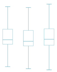
3.2 BoxPlot Chart :
One Dimension One Measure
Or One Measure
When to use:
Summarize the distribution of a single measure, including outliers.
Compare distributions across groups (e.g., income levels by profession).
Best practices:
Label axes clearly with units and measure name.
Use consistent colors for boxplots if comparing groups.
Consider adding horizontal lines for median and other quartiles.
Highlight outliers (if any) for further investigation.
Limitations:
Limited ability to show data density within each quartile.
Not ideal for visualizing trends over time or complex relationships.
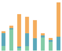
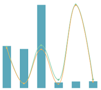
3.3 Stacked Column Chart :
One or More Dimensions
One or More Measures
When to use:
Shows how a measure is composed of multiple sub-categories within each main category.
Analyze sales breakdown by product category and region, website traffic sources over time, etc.
Best practices:
Limit to 5-7 stacked bars for readability.
Use distinct and visually appealing colors for each sub-category.
Ensure clear labelling of categories and sub-categories.
Consider interactive features for drilling down or filtering data.
Limitations:
Can become visually cluttered with too many sub-categories.
Not ideal for comparing individual sub-categories across different main categories.
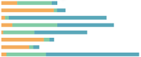
3.4 Stacked Bar Chart :
One or more Dimensions
One or more Measures
Similar to stacked column charts, but with horizontal bars. Use when space is limited or labels are long.
3.5 Stacked Area Chart :
One or more Dimensions
One or more Measures
Similar to stacked column charts, but with areas filled, emphasizing the cumulative contribution of each sub-category.
4. Data Display Widgets:
4.1 Bubble Chart :
One or more Dimensions
One or more Measures
When to use:
Represent three variables: two dimensions and one measure using bubble size.
Analyze product sales based on price and category, website traffic by source and region, etc.
Best practices:
Limit to 100-200 bubbles for readability.
Use color variations to represent additional qualitative dimensions.
Ensure clear labelling of axes and measure values.
Consider interactive features, tooltips for exploring data points on hover.
Limitations:
Can become visually cluttered with many bubbles.
Difficult to compare individual data points precisely due to bubble size variations.
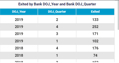
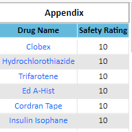
4.2 Table :
One or more Dimensions or Measures
When to use:
To Present raw data or detailed information not effectively summarized by other visualizations.
To Provide context or explanations for other charts.
Best practices:
Keep tables concise and focused on relevant data.
Use clear and consistent formatting (e.g., headers, borders).
Consider sorting, filtering, or pagination for larger datasets.
Add tooltips or hover effects for displaying additional information.
Limitations:
Can be overwhelming for users with large amounts of data.
Not ideal for highlighting trends or patterns visually.
4.3 CrossTable :
One or more Dimensions
One or more Measures
When to use:
Analyze and summarize data by grouping and aggregating across multiple dimensions.
Analyze sales figures by product, region, and time period, customer demographics by age and income, etc.
Best practices:
Keep the table focused on a specific question or analysis.
Use meaningful row and column headings for clear understanding.
Consider sorting or filtering data for clarity.
Choose informative summary statistics (e.g., average, count) for each cell.
Limitations:
Can be complex to interpret with many dimensions and aggregations.
Not ideal for visualizing trends or relationships visually.
4.4 Text :
Enter Simple Text
When to use:
Provide simple labels, annotations, or explanations for other visualizations.
Highlight key findings or conclusions from data analysis.
Best practices:
Use clear and concise language.
Format for readability with headings, bullet points, etc.
Align with the style and tone of your overall presentation.
Limitations:
Can be easily overlooked if not visually integrated with other elements.
![]()
4.5 Html :
Provide HTML Snippet
When to use:
To Embed interactive elements, web page content links within dashboards
To navigate from one page of dashboard to another
Best practices:
Ensure code is secure and well-tested.
Follow web accessibility guidelines to ensure inclusivity.
Test thoroughly across different browsers and devices.
Limitations:
Requires HTML knowledge for implementation.
May introduce compatibility issues or security risks.
5. Visual Elements:
5.1 Image :
Browse image or provide URL
When to use:
Display photographs, logos, illustrations, or other visual assets.
Break up text-heavy content and add visual interest.
Best practices:
Use high-quality images with relevant resolutions.
Optimize image size for web or app performance.
Add alt text for accessibility and SEO.
Limitations:
Can increase file size and loading times.
Limited ability to convey data insights compared to interactive visualizations.
5.2 Card :
One Measure or One Dimension
When to use:
Present summarized data points or key metrics efficiently.
Create dashboards with focused information snippets.
Best practices:
Limit to one or two key measures per card.
Use clear and concise labels and values.
Maintain consistent visual design across cards.
Limitations:
Limited space for detailed information or analysis.
Can become visually repetitive with many cards.
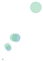
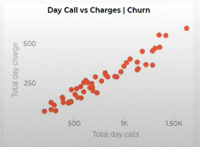
5.3 Scatter Plot Chart :
One or more Dimensions
One or more Measure
When to use:
Explore relationships between two numerical variables.
Identify correlations, trends, or clusters within data.
Best practices:
Limit to 2-3 dimensions for readability.
Use distinct marker shapes or colors for different categories.
Consider adding trendlines or regression analysis.
Allow for zooming and filtering for large datasets.
Limitations:
Can become visually cluttered with many data points.
Not ideal for complex relationships with more than two variables.
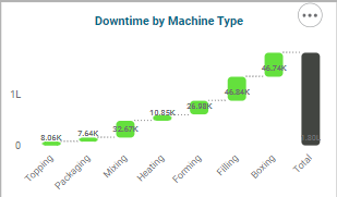
5.4 waterfall Chart :
One or more Category
One or more Measure
When to use:
Show how an initial value changes through a series of positive and negative contributions.
Analyze profit and loss statements, cash flow breakdowns, etc.
Best practices:
Clearly label each contributing factor and its impact.
Use consistent colors for positive and negative contributions.
Start and end with clear total values at the beginning and end.
Limitations:
Not ideal for many contributing factors due to limited space.
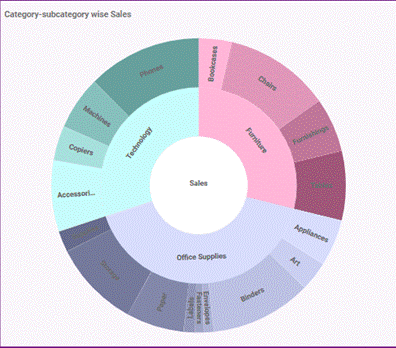
5.5 Sunburst Chart :
One or more Dimensions
One Measures
When to use:
Visualize hierarchical data with multiple levels of categories.
Analyze product category breakdowns, organizational structures, etc.
Best practices:
Limit to 3-4 levels of hierarchy for readability.
Use clear and concise labels for each level.
Consider interactive features for drilling down and exploring different levels.
Limitations:
Can become visually complex with many levels or categories.
Not ideal for comparing values across different branches of the hierarchy.
6. Interactive Widgets:
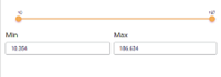
6.1 Solid Gauge Chart :
One Value, One Min, One Max, One Target
When to use:
Track a single metric against a predefined range and target.
Display key performance indicators (KPIs) on dashboards.
Best practices:
Clearly label the gauge value, range, and target.
Use contrasting colors for target and actual value.
Consider adding context or explanations for gauge variations.
Limitations:
Limited to displaying one metric at a time.
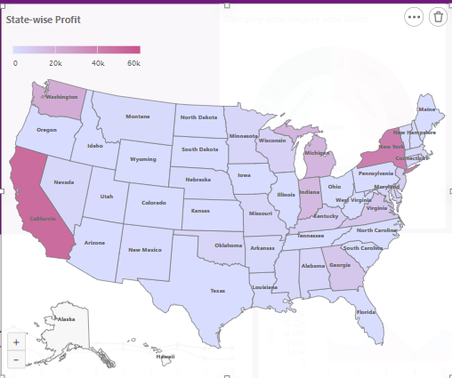
6.2 Map :
One Dimension
One Measure
When to use:
Visualize data with a geographic component.
Analyze sales by region, customer demographics by location, etc.
Best practices:
Choose an appropriate map projection based on your data and analysis goals.
Use clear and concise labels for locations and data points.
Offer zooming and filtering for detailed exploration.
Limitations:
Can be visually complex with many data points or layers.
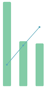
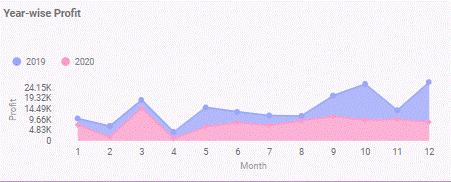
6.3 Combination Chart:
One or more Dimensions
One or more Measures
When to use:
Combine multiple chart types (e.g., line and bar) to display different aspects of the same data.
Show trends and comparisons within different categories or over time.
Best practices:
Ensure consistent axes and scales for meaningful comparison.
Use clear legends and labels to differentiate data series.
Limitations:
Requires careful design and alignment to prevent misinterpretation.
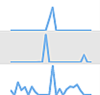
6.4 Sparkline:
One or more Dimensions
One measure
When to use:
Provide quick overviews of trends or patterns within limited space (e.g., dashboards, tooltips).
Show trends in sales over time, website traffic fluctuations, etc.
Best practices:
Keep it simple and focused on a single measure.
Use clear and consistent line styles or colors.
Limitations:
Limited information density due to small size.
May require additional context or explanation for users to understand.
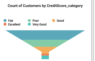
6.5 Funnel Chart:
One or more Dimensions
One or more Measures
When to use:
Visualize stages in a process and how values drop off or progress at each stage.
Analyze sales conversion funnels, marketing campaign stages, etc.
Best practices:
Clearly label each stage and its corresponding value or percentage.
Ensure the widest section represents the starting point and narrowest section the end.
Consider adding annotations or tooltips for stage-specific details.
Limitations:
Not ideal for comparing multiple funnels with different starting values or stages.
7. Additional Widgets:
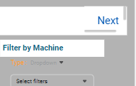
7.1 Filter Widget:
One Dimesnion
When to use:
Allow users to dynamically filter data based on specific criteria.
Explore different views or subsets of a larger dataset on dashboards or reports.
Best practices:
Provide visual cues (e.g., checkboxes, dropdown menus) for easy selection.
Update visualizations instantly based on selected filters.
Offer reset or “select all” functionality.
Limitations:
Requires users to understand available filters and their impact.
Too many filters can overwhelm users and lead to complexity.
7.2 Bullet Chart:
One Category, One Values, One Min, One Max, One Target
When to use:
Compare a single key metric against a target, range, and qualitative indicator.
Track performance metrics on dashboards or reports.
Best practices:
Clearly label the actual value, target, range, and qualitative indicator.
Use contrasting colors for the actual value and target.
Choose an appropriate qualitative indicator (e.g., good, bad) based on context.
Ensure the bullet size reflects the relative value to the target.
Limitations:
Limited to tracking one metric at a time.
7.3 Google Map (Under progress):
Visualizes data on a Google Map.
7.4 Parameter Widget:
One Parameter
When to use:
Allow users to input numerical values that dynamically affect other visualizations or calculations.
Enable user interaction and exploration of different scenarios or data variations.
Best practices:
Clearly label the parameter and its units.
Provide constraints or ranges for valid input values.
Update visualizations immediately and visibly based on parameter changes.
Offer default or reset values for easy navigation.
Limitations:
Requires users to understand how the parameter affects the visualizations.
Too many parameters can lead to complexity and confusion.